Sorry for confusing anyone with my last post. It was part of an experimental video I made a few months ago.
The video used blogs as an example of how everyone has become a "writer," and yet how professional writers still exist. In fact, talented professional writers have many opportunities, are in demand, and have a lot of power to wield these days. How is this phenomenon the same for Design and people who call themselves designers? I'd like to think it is very much the same. Still, Design has along way to go to become truly established as a discipline, and I hope that designers, not others, will be the ones laying the foundation.
I was quite satisfied with the video I produced on this subject. I created it with my computer, some code, and a bit of live performance. It makes my case in a much more poignant fashion. I hesitate to show it as a small embedded video. It is meant to be experienced on Mac at full-screen(you'll see why.) However, for the sake of getting it some kind of exposure I put it in this post.
Enjoy!
Monday, June 15, 2009
Sunday, March 29, 2009
THE BLOG
Noooooooooooooooooooooooooo
ooooooooooooooooooooooooo
ooooooooooooooooooooooooooo
oooooooooooooooooooooooooooo
ooooooooooooooooooooooooooooo
oooooooooooooooooooooooooooooo
oooooooooooooooooooooooooooooo
oooooooooooooooooooooooooooooooo
oooooooooooooooooooooooooooooooo
oooooooooooooooooooooooooooooooo
ooooooooooooooooooooooooooooooooooo
ooooooooooooooooooooooooooooooooooo
ooooooooooooooooooooooooooooooooooooo
oooooooooooooooooooooooooooooooooooooo
ooooooooooooooooooooooooooooooooooooo
ooooooooooooooooooooooooooooooooooooo
ooo!!!!!!!!!!!!!
ooooooooooooooooooooooooo
ooooooooooooooooooooooooooo
oooooooooooooooooooooooooooo
ooooooooooooooooooooooooooooo
oooooooooooooooooooooooooooooo
oooooooooooooooooooooooooooooo
oooooooooooooooooooooooooooooooo
oooooooooooooooooooooooooooooooo
oooooooooooooooooooooooooooooooo
ooooooooooooooooooooooooooooooooooo
ooooooooooooooooooooooooooooooooooo
ooooooooooooooooooooooooooooooooooooo
oooooooooooooooooooooooooooooooooooooo
ooooooooooooooooooooooooooooooooooooo
ooooooooooooooooooooooooooooooooooooo
ooo!!!!!!!!!!!!!
Sunday, January 04, 2009
CAR SONG :: A project in communicating with sound and motion.
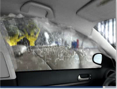
The assignment was to communicate the words "object" and "system" using just sound first and then using sound and motion. I've done these types of assignments before and sometimes they can result in less than impressive work but this time was different. I began by using what I had, a mini DV camera and a car. I was just experimenting with recording the sounds of the car as a system of objects.
By happenstance I shot at night and had just a flashlight for lighting. This resulted in a dark, gritty tone for the video that I took to liking. I digitized the footage and began messing with the sound. Eventually the sounds became a beat, and then became a song. The song was dark and tough sounding, a perfect match for the visual style of the video footage. I decided to go back and shoot again under the same conditions, in the dark with just a flashlight. This time I composed shots to go with the completed song. I used a shot list and some thumbnails to guide me. The result was quiet nice.
The video is, of course, not meant to have glossy, large scale, film-like production value. It needed to be amature so that the idea of the piece would be understandable. I've had many people comment that this would make a great car commercial. Maybe. I think what is interesting is not the video itself but the idea behind the creation of the video and the fact that the viewer clearly understands that all the sites and sounds come from the same object/system. If this was a flashy car commercial I think it would read differently.
Thursday, October 30, 2008
REDESIGNING WIKIPEDIA :: A Project in Productive Interaction

This is a complex project with a detailed record of my process. If you would rather read the project description and see the video prototype, find a computer with a large screen and go here.
MOTIVATIONS ::
Having gained a new understanding of how to apply design according to productive interaction, I immediately sought to apply this perspective on the Wikipedia assignment. Since Wikipedia is already a structure built with user-generated content I sought to find a solution gave even more power to the user and allow them to create their own sense of meaning.
CONCEPT DEVELOPMENT ::
As a group we agreed that Wikipedia users are currently creating meaning by compiling and juxtaposing information as the casually browse a topic and it's surrounding related topics. However, Wikipedia is not currently designed with the affordances to make this an easy process. I suggested the creative direction of treating Wikipedia as a structure where people experience journeys of information gathering. I felt it was important to recognize the nature of learning by browsing that occurs on Wikipedia and to embrace the spontaneous occurrence of jumping to link relevant and less-relevant topics. We agreed upon this direction, wrote a creative brief, and decided to tackle the task of creating the needed affordances.


To better understand how search topics and link topics relate I created a couple of maps visualizing this relevance using a vertical and horizontal planes as a guide. Link topics with high relevance to the search topic were mapped on horizontal plane while unrelated topics were on a vertical plane. I wanted to allow users to see this relevance before and after they clicked on a link as an indication of the path they were leading on their journey of gathering information.
 DESIGN/FEEDBACK PROCESS :: My initial design stimulated my thoughts on the possibilities of tracking browsing and allowing others access to your journey as an additional layer of information through juxtaposition and compilation. I designed three initial applications for assisting in this: Travel Log, Saved Journeys, and Public Journeys. I presented this design and explained how a user would not only be able to track their browsing history for their own reference but would also be able to curate information for others to observe publicly. With feedback on my design and the other two designs by my teammates, we decided to further apply this idea of curation in our next iteration.
  The next design was built out by one of my teammates applying an agreed upon structure. After the initial structure was designed I refined the design of functional elements and added the design of key features. One of my teammates took this design and created a working comp that was again presented to the class for feedback. Somewhere in this process of feedback we realized the power of these journey-related applications and proposed the idea of allowing for a customizable application space were any number of possible apps could be applied. This was one of the great results of the feedback.
 Our final design took into account all of the feedback and added the additional in-depth design of the applications space. After my teammate made some initial aesthetic changes I designed the application space with examples and added additional pages needed for an accurate presentation of our concept.


DEVELOPMENT ::
Adding the application space increased considerably the work load on the programming end. At a certain point I realized that my teammate would not be able to complete a full and accurate representation of our concept with out some help. At this point I began programming certain aspects of the site mainly, Current Journey/Saved Journey/Public Journey applications, the Media Viewer and Assisted with the Britannica/CNN applications, Journey Mapper, Content Toggle feature.
PRESENTATION ::
I presented the final prototype of our site along with my teammates and we received great feedback on the idea of the customizable application space. Much of the feedback proposed ideas for other possible applications, which I felt was a manifestation of having a design that focused on being a structure for productive interaction.
LEARNING OUTCOMES ::
I gained two overarching insights from this assignment. First, creating dynamic structures with the goal of productive interaction means you must consider what seems to be an endless amount of variables and possibilities. These considerations would then have to be applied to the design to create an comprehensible structure for interaction. Second, I became more accustomed to additive solutions as opposed to reductive solutions to problems. Design on the surface aesthetic level is primarily a process of simplifying for the purpose of communication. This is something I am very used to. However, when you are creating structures for interaction the design should give the user as much control as possible and therefore designing becomes an additive process.
Thursday, September 25, 2008
OBJECT & SYSTEM :: A Transmedia Design Project (in progress)

Here is a work in progress for my Transmedia Design class.
Assignment: Communicate the meaning of the words "Object" and "System" using print as a medium and only typography as a method.
In my research on the topic I found this summary of Ferdinand de Saussure's words on written language: "The sign has no life apart from the system or 'structure' that frames it." This made me think of the relationship between an object and a system, and how one cannot be defined without referencing the other. In a sense, every object is made up of a system of objects interacting with each other, and every system is described by the objects that are a part of it. This led me to think of the idea of how the letter, as an arbitrary object, gains meaning as a part of the alphabet and subsequently as part of a word. I decided to take the concept of letter(object) and the alphabet(system) and explore ways of communicating this in print form.
I came up with the following ideas:
1- Stack all the letters of the alphabet on top of each other at 20% opacity and see what "ghost form" emerges.
2- Using two posters juxtapose the bump to the braille system on two posters.
3- Use type as line to create a flatpack object that can be assembled by reading the lines.
4- Compose a large halftone letterform where each dot is an individual letter.
5- Arrange text in an illusion that represents 3D-cubes and spells out the word "system".
6- Create a word illusion with the words "object" and "system" by combining them into a single form.
After receiving feedback on these ideas I decided to proceed with the braille idea and the flatpack idea. I then made rough comps.


Moving forward, I did some research on de Sausser's writings about written letters and systems, and looked at readymech.com for inspiration on flatpack toys. After finding the content I needed I decided to research braille printing technology and found that it is very difficult to achieve in large format. I spoke with one of the MDP(Media Design Program) instructors who did a thesis on braille. He recommended using the campus laser cutter and creating a mold on which I could place a sheet of paper and rub to create the bumps.
With that I aimed to create a sample that I could experiment with and therefore spent an afternoon in the laser cutting lab. Using the window as a light board and that backside of a Sharpie as a mezzotint tool, I rubbed the paper on top of where the holes were located on the laser-cut acrylic. I tried a variety of paper weights and with 2 ply bristol it yielded a favorable result.


I also spent a night designing the flatpack toy based on a template by readymech.com. The tiny text used to create the lines was the directions for assembling the piece, for example, "1. Cut along this line using an x-acto blade and a straight ruler," or "score fold score fold score fold."

Lastly, I presented both these ideas in a more finalized comp form to the class for feedback. The next step is to move forward with the actual production of these ideas until they reach presentation quality. I will post again at that point. Wish me luck.
Wednesday, September 10, 2008
Holy Art Center!
 Sure Pasadena is great, our apartment is unique, and my trip to Emerald Bay on Catalina Island was memorable, but my first week at Art Center College of Design was amazing. After a week of typical orientations we started an event that the Media Design department calls the Charrette and Dialectical Bus Tour.
 On Friday we started with a tour of the Warner Brothers' Studio backlots. Instructors from the Media Design Department (MDP) commented on the history of hollywood and related theories in media design like, inherited fabricated reality. This is the theory that our perception of how a place should look is effected by how it is depicted to mass audiences through media like the movies. Eventually these perceptions emerge in realistic forms of architecture and art. For example, a person who has never been to Paris may only recognize the Eiffel Tower and the look of cobble stone streets as depicted through a movie set. Overtime this becomes a dominant perception even though most of Paris may actually look differently. This phenomenon has been known to effect how city planners might redesign streets to be more "Parisian." In actuality they want the design to be more "Homogenized Hollywood depiction of Paris." While at the WB studios we visited the set of E.R.(currently shooting), Pushing Daisies, Chuck, Friends, and a other historically significant backlots. I also saw the costumes and props from The Dark Knight, which arrived this month, a bunch of Harry Potter stuff and old historical stuff.(photography was prohibited)
The second part of the tour took us to the Americana, an all-in-one shopping and living experience. This was an example of how Hollywood has shaped fabricated reality into actual structures. The mall unsettlingly similar to the backlots we had just visited. The scenery, lighting, uniforms, and facades were picturesque from any angle, creating an experience as if you were the star actor walking through your own movie. We talked about the planning and design that went into the Americana to make it a medium for the perfect purchasing experience. We were separated into groups and received our assignment to design a city as a medium that communicates an idea. We were given two large pieces of foam core and any other tools we might need and had to be ready for part two of the assignment and critique on Sunday.
Saturday morning we met and planned the design for the structure of the city. Out of several ideas, I presented an idea that used a triangular structure for the buildings that allowed for two screen surfaces when viewed from a distance. I thought it should be built in an angled ravine to allow for four viewing positions. This eventually became a ravine angled at 45 degrees with structures jutting out of the side at 90 degrees. This design created three different screen surfaces, including one from the top as seen from a plane or Google earth. We spent the day building the structure and began talking about the narrative of the city. With the structure having two sides facing inward it seemed logical to make this the city of competition. We decided to reveal the annual income of each of it's inhabitants with an icon depicted on the screens. As one side look at the other they naturally compare themselves. As the two sides compete to display a higher income we can assume that the average income of the city would increase. This income would be depicted on the top screen and in a way enticing any neighboring cities to competition. Do you get it?
On Sunday we started bright ant early on the Dialectical Bus Tour. We drove and walked through L.A., mainly downtown, and talked about the history and theory involved. Downtown L.A. is so peculiar. There are basically four layers of history: vacant victorian high rises, 60's and 70's patchwork refurbishing, 90's steel sky scrapers, and the present inhabitation of cheap mexican retail. What's interesting is that it seems that the city keeps trying to make a Manhattan out of downtown even though the model of the wide open west resists vertical expansion. These projects fail over and over leading to a mess of abandoned buildings with cheap street level occupants. Some buildings make more money as a permanent Hollywood set than by real estate.

(Architectural layers on Broadway: 1920's victorian, present day fast food store, 1960-70's latin influence)


(Cheap Mexican retail space in foreground, expensive skyscrapers in the back)
(Here a small business has begun to build a facade over the abandoned 1970's high rise)
(The inside of the Bradbury Bldg. one of the last used high rises of the victorian era and star of Bladerunner and several other films)
(An example of the cheap Mexican
 merchandise sold exclusively on the street level)
(Ironic photo #1: "Not in Use" sign on abandoned high rise)
(Ironic photo #2: Modern "L.A. Vision" signage on 1920's Victorian building.
 What vision they had for their building and for downtown)
I was intrigued and disgusted at the same time. Most interesting was the commentary by MDP instructors, an LA Historian, Historical Architect, and Design Theorist. Needless to say, my mind was full at the end of the tour.
Sunday night we received part two of the assignment: using what we observed of L.A., turn our city into a new version of L.A. I quickly landed on an idea that worked great. Our city was just another layer to add to the many architectural layers of the past. We would heap up earth on the abandoned downtown L.A. and use it as a foundation for our new city. After we decided this we had about two and a half hours to prepare for our crit. We divided up the assignments and started cranking. I helped take photos of our structure, photoshopped a cross section of the city and compiled all the work in Final Cut to create a video. Keep in mind that the design was meant to communicate, not necessarily look pretty. Lastly we prepared for our presentation. As I worked I occasionally felt the tendency to check on the work of my teammates but then I would remember that everyone is a pro at this stuff. It was cool to be in that kind of situation with a completely competent team.

All went superbly well. The critics(MDP Faculty), loved the idea and were inspired to develop more scenarios besides annual income, to which they encouraged us to explore. I felt my ability to present and answer questions was also superb and that made me happy. All in all this first week was crazy and amazing. I am impressed with everything about Art Center, the campus and equipment, the faculty, the student body, and the experience.
Video Description:
1. Side view of structure and overlay of icons
2. Display of screens side and top
3. Displaying how competition is built into the structure with two sides facing.
4. City cross-section showing how the new urban layer is built on the old.
5. Simple representation of social space in the middle, the only safe zone.
6. Animation of moving icons
7. Close-up on moving icons
8. Overhead view of city displaying top screen projection of average income.
Sunday night we received part two of the assignment: using what we observed of L.A., turn our city into a new version of L.A. I quickly landed on an idea that worked great. Our city was just another layer to add to the many architectural layers of the past. We would heap up earth on the abandoned downtown L.A. and use it as a foundation for our new city. After we decided this we had about two and a half hours to prepare for our crit. We divided up the assignments and started cranking. I helped take photos of our structure, photoshopped a cross section of the city and compiled all the work in Final Cut to create a video. Keep in mind that the design was meant to communicate, not necessarily look pretty. Lastly we prepared for our presentation. As I worked I occasionally felt the tendency to check on the work of my teammates but then I would remember that everyone is a pro at this stuff. It was cool to be in that kind of situation with a completely competent team.

All went superbly well. The critics(MDP Faculty), loved the idea and were inspired to develop more scenarios besides annual income, to which they encouraged us to explore. I felt my ability to present and answer questions was also superb and that made me happy. All in all this first week was crazy and amazing. I am impressed with everything about Art Center, the campus and equipment, the faculty, the student body, and the experience.
Video Description:
1. Side view of structure and overlay of icons
2. Display of screens side and top
3. Displaying how competition is built into the structure with two sides facing.
4. City cross-section showing how the new urban layer is built on the old.
5. Simple representation of social space in the middle, the only safe zone.
6. Animation of moving icons
7. Close-up on moving icons
8. Overhead view of city displaying top screen projection of average income.
Monday, August 04, 2008
Past Work :: LIFELESS THE SERIES


This is a side project I worked on over the summer of 2007. LIFELESS is a pilot series written and directed by David Sasich. I was initially asked to do the production design for the piece but didn't have the time available. Dave came back to me after the shooting had been completed and asked if I would design the title sequence, logo, website, press kit and other merchandise. LIFELESS is a story of survival, kind of a cross between a typical zombie horror and LOST. I wanted the design to convey the intensity of a thriller but still remain sophisticated enough for a LOST-loving audience. My answer to this was the blood splatter in black instead of red. This became an iconic theme that continued throughout all the promotional pieces. I spent many a day splattering black paint all over the place, especially during the shooting of the title sequence. On a side note, my hand is the one used in the title sequence.This turned out to be quite the side project and was more involved than the production design bit. But it was fun. I have displayed the title sequence and logo. The motion graphics were created by Tanner Christensen under my direction.
Past Illustration :: GREMLIN

Just a quick illustration for the fun of it. Pen and wash on watercolor paper.
Wednesday, July 30, 2008
Past Illustration :: SOCIALIST GIRL

Here is an illustration I did last year on my personal time. I was experimenting with layering watercolors, pencil and a white prismacolor. Inspiration for the drawing was taken from a photo of a Mongolian woman in one of my National Geographic magazines. I obviously changed the context to something more communist with the addition of the rifle and grimace.
I have been wanting to get away from doing representational art and into a realm that uses graphic design elements in the composition. I don't think I nailed it on this piece, there are several ways to improve it. However, I was please with what I learned about the combination of media while working on this illustration.
On the bottom half of the piece I applied heavy amounts of a burnt umber based color and then scraped it away with a paper towel to give texture. Additionally, I sprinkled water droplets and then dabbed away the water with a paper towel to give it that splotched look.
Tuesday, July 29, 2008
Past Work :: TONY DIVINO TOYOTA
As the Art Director on this campaign I was responsible for the concept, design and execution of all pieces. The message of honesty required an honest, straight forward approach to the design. For this reason I selected the simple typography on a field of color. My greatest accomplishment on this was illustrating and animating a woman with horns and a winking toilet.
This campaign received several local awards, including a judges choice award, and several Regional Addy Golds.


This campaign received several local awards, including a judges choice award, and several Regional Addy Golds.


Past Work :: SIEMENS HEARING INSTRUMENTS


I've decided to turn this blog into less of a commentary and more of a personal process blog. I hope to provided continual insight into the work I'm currently working on and how I go about creating it. Before I display what I am currently working on, I'll get caught-up on much of the work I created over the past two years.
SIEMENS HEARING INSTRUMENTS
My primary role in this campaign was as the illustrator, although I did assist in refining the concept. I spent an estimated total of 30 hours on these pencil drawings.
This campaign received a several local awards, National Addy Silver, and New York Festivals Merit.
Thursday, March 15, 2007
Helvetica - The Film.

Here's another interesting industry related film. It's a documentary by Gary Hustwit about the most used typeface of our time, Helvetica. I think most of the film is spent showing the millions of places that Helvetica is used through out the world. You can watch a two minute and thirty three second clip of applications in Berlin, found in the trailers section of the website, www.helveticafilm.com. Whether or not you like Helvetica or not is up to you but an interesting point made in the film is that the emotional effects of typography are subtle but impacting and because of the abundance of applications of Helvetica, each person has sort of a different experience and emotional tie with it. It's ironic that Helvetica was developed by the Swiss to be a neutral typeface.
The film is screening internationally, mostly in major cities. Designers of all types should at least take the time to visit the site and learn a bit. Another great article about the film is in the March/April edition of I.D. magazine. It's a Q&A with Hustwit that got me pumped-up about seeing the flick. Then again, there are probably many of you who could care less about the type most used on the bathroom sign.

Thursday, December 21, 2006
The Alchemists

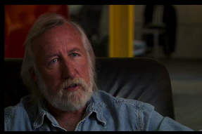
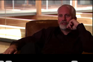 I found this movie trailer on Room 116, it’s for a movie called The Alchemists, a documentary on some of the most influential advertisers of our day. This will a significant film, no matter how it actually turns out because there has never been a film created for the public that accurately gets into the details of the creative process of advertising. I believe it will do two positive things. First, it will educate the public on what we really do. Hopefully I’ll get to do less explaining to my friends and family. It’s kind of like pulling the curtain back and revealing the Wizard of Oz. Second, There is a chance that the film might portray our job as something “decent” to the public. It would please me to see the public realize that we aren’t evil people with a plot to corrupt the world. Of course, there’s a chance that the film may actually reinforce this mindset. I guess we will see.
• Watch the Trailer
Wednesday, August 16, 2006
What CP+B Has Taught Me
My time at CP+B is coming to an end. It has been intense, long, exhilarating, too short, fun, challenging, easy, tiring, amazing, and very real. I have learned far more than I desired and missed out on too much. It’s these crucible types of experiences that are never forgotten. I hope my notes have given a peek to those who want to see what this place is all about. Below I will try to summarize much of what I have learned for those who missed out.
Before I get to the summary, I wanted to address something I mentioned to some friends. A few weeks ago CP+B had a few all-agency meetings in which Alex, Chuck, Jeff Steinhour, and a few BK big dogs spoke. I took notes and by request intended to post what was said. I want to apologize to those who are expecting these notes and explain why I have decided to withhold. It’s like many experiences in life that can only be understood by being there yourself. Working at CP+B is like this. You really can’t grasp how hard they work, how strong their culture is, or how much energy is within the walls without working there yourself. So I have chosen to keep the events of that meeting to myself, so they remain as inspiring as they were the day they happened.
If this disappoints you I have some advice of my own, work on your book, make a contact, and apply for an internship at CP+B around April. Like CP+B has shown me, good things come to those who work for them.
Here is an attempt at a summary of what I have learned here at CP+B:
1. A strong culture is what makes CP+B successful. Foster a culture unique to your organization, believe in it, and live it.
2. Advertisers don’t have to back down to every whim of the client. In fact, if you aren’t pushing for what you believe is best you are giving less than what they contracted you for.
3. Say the simple message. The strategy, nothing more. (Thanks Paul K.)
4. Most agencies don’t get as much recognition as CP+B because they don’t work as hard. Believe it, I’m not exaggerating.
5. Working too hard inside all the time can make all the work look alike, and push even the most creative to quit.
6. Making boundaries between the youngest creatives and the most experienced creatives can be really annoying when you believe in the principle that the idea is boss.
7. CP+B truly believes the idea is boss.
8. Do something that relates to culture, or even better creates it.
9. There is a reason behind all the madness of CP+B. Don’t believe it? Compare the cost of rent in Miami to the cost of buying in Boulder.
10. Don’t pay attention to haters.
11. While some egos do exist at CP+B, nothing gets in the way of the work getting out.
12. Everyone is busy. Everyone helps.
13. Communication could be much better if everyone listened to the traffic department.
14. Do something courageous, bold, and brave.
15. Alex is not a robot. He is somewhat of a genius. If you have ever wondered if he really deserves the attention, know that I personally witnessed his wisdom and it comes because he is a real person.
Thanks to all who gave these entries even half of a wink,
Concept Hunter
Wednesday, July 12, 2006
Input = Output
 Up until now my only posts about Crispin Porter + Bogusky have been positive. I admire much about the agency and the way they work. However, if I am committed to sharing my truthful observations I must include my criticism.
Advertising is a very intense industry, everyone works hard, no matter what agency you work in. However, I feel that CP+B must be near to the top of the list . No matter what day and hour you walk in to the agency you will find people working. As an intern I recently spent a full week and a half working until at least 3am everyday, on several priority projects. It was expected no one flinched at the thought. So believe me when I say CP+B is likely the hardest working agency right now. This is good to know. With all the hype the CP+B receives, it is nice to know that it has been paid for with extreme effort.
So now I get to my criticism, which is that advertising is also an industry dependent upon ones ability to communicate effectively with everyday people, and in order to do this you must make a practice of taking in the world around you. In general, CP+B seems to be lacking this practice.
So much work is done inside the concrete block of an agency that It seems they are getting better only at talking to themselves. For example, a once, very mainstream VW audience has now become a, people-like-CP+B VW owners audience. The humor in the BK campaign is very much CP+B humor. I also recently saw a concept that combined two CP+B clients in one execution. That just feels wrong and not in line with true creativity. This doesn’t mean they aren’t doing a good job. The clients are happy, sales are up, and I am very impressed myself. This may be just a personal opinion in the end, but I feel that it takes great input to create great output. Get out side and live for a while. It may improve the ability to talk to people you live with. We should always remember that it is these people who are the very audiences seek to communicate with.
• Breed a VW rabbit
Wednesday, June 21, 2006
Surface Level Thinking
 I haven’t been in the business long. I’ve only worked at a few agencies and seen a few different styles. So when I talk about the industry as a whole, I’m sure there are exceptions. However, from my observations I feel there is a tendency that hinders the ability for creatives to come up with innovative traditional and “nontraditional” advertising. Too often the creative brief will state the required medium in the first paragraph. I have learned and agree with something they do here at Crispin Porter + Bogusky. I call it surface level thinking. Long before you start thinking of a medium, you begin by thinking of the most basic, creative way to express the value of the product. For example, the target of the Volkswagen GTI has a nagging urge to drive fast. What if we represent this urge with a character that says out loud what these drivers are thinking in their heads? You come up with a ton of these small thoughts and present them to your Creative Director. After you have a few good thoughts then you continue to push them out until they eventually fall into the best medium fit for the message. The key is to stay on the surface and let the best ideas find their way to a root (medium). CB+B calls this thinking of creative content. I heard about this process first at a Utah Ad Fed luncheon where Jamie Webb spoke about it. Jamie did a great job explaining it, but now I realize how possible it is that no one really understood him enough to know how to do it. I hope this post helps.
• Why the sumos? www.sublymonal.com
Friday, June 16, 2006
Technology in Advertising for Dummies
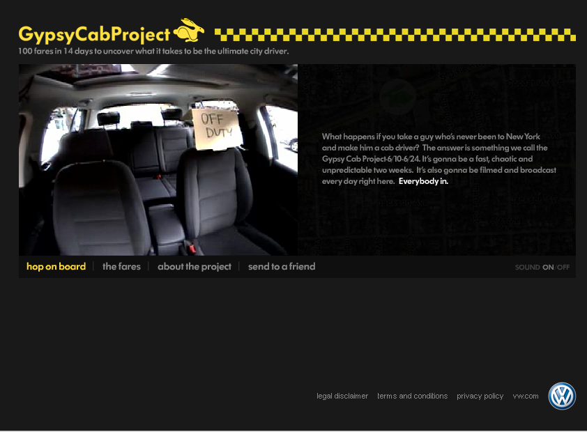
No, I don't mean to be offensive; I'm referring to how we all are learning how to use technology to convey advertising messages. I'm also referencing three projects that we can use to learn from; similar to how we use "(blank) for dummies" books. I'll start with the most impressive example first. www.gypsycabproject.com uses live video feed from a VW Rabbit taxi cab. The cab driver has never been to NY and you as the viewer get to experience it all with him. This is an genius CP+B project that mixes new technology in a unobtrusive manner, and it's something more than just a website.
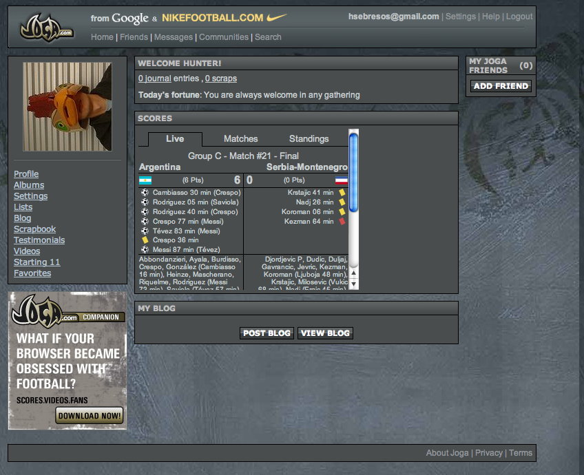
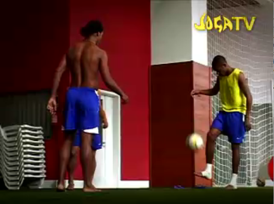
The second example is a videocast and minisite by Nike and Google. For those less familiar with videocasts, they are free downloadable video clips created and posted by anyone. This project is called Joga Bonito (Play Beautiful), and promotes the play of futbol, football, or soccer, with finesse. The amazing part is that it combines the great videocast with a minisite that allows you to join the Joga community. Joining gets you in contact with other soccer fanatics and gives you a personal Joga blog, which you can use to keep in contact with these fans. Visit iTunes to find the videocasts and www.joga.com to see the minisite.
The last example is another VW/CP+B project. If you go to www.vwfeatures.com you can customize a Jetta and crash it into various things. It is a fun way to use CGI in a educational manner and keep the severity of car accidents in a humorous tone.
After my last post I received a comment that I sounded a little lofty. Well, I agree. I did get a little high on a soapbox. However, I believe there is a drastic change that needs to occur in several dinosaur agencies. It doesn't make them wrong or stupid; the bigger the ship the longer it takes to change course. I felt that these few examples may be a good example of how admirable companies like VW and Nike are willing accepting these technological advances. Let's not fall behind. Let's lead the way as advertisers and embrace these great new media.
The second example is a videocast and minisite by Nike and Google. For those less familiar with videocasts, they are free downloadable video clips created and posted by anyone. This project is called Joga Bonito (Play Beautiful), and promotes the play of futbol, football, or soccer, with finesse. The amazing part is that it combines the great videocast with a minisite that allows you to join the Joga community. Joining gets you in contact with other soccer fanatics and gives you a personal Joga blog, which you can use to keep in contact with these fans. Visit iTunes to find the videocasts and www.joga.com to see the minisite.
The last example is another VW/CP+B project. If you go to www.vwfeatures.com you can customize a Jetta and crash it into various things. It is a fun way to use CGI in a educational manner and keep the severity of car accidents in a humorous tone.
After my last post I received a comment that I sounded a little lofty. Well, I agree. I did get a little high on a soapbox. However, I believe there is a drastic change that needs to occur in several dinosaur agencies. It doesn't make them wrong or stupid; the bigger the ship the longer it takes to change course. I felt that these few examples may be a good example of how admirable companies like VW and Nike are willing accepting these technological advances. Let's not fall behind. Let's lead the way as advertisers and embrace these great new media.





Subscribe to:
Posts (Atom)
